

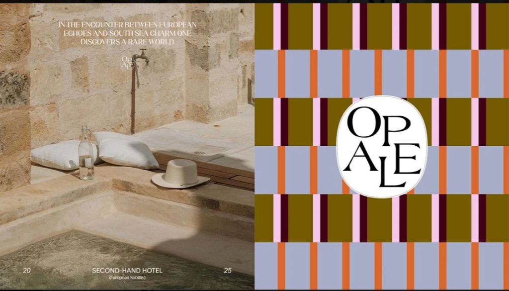
OPALE is a boutique hotel branding concept inspired by the meeting point between European elegance and the warmth of a tropical destination.
The visual identity explores a balance between historical romance, sophisticated hospitality, and contemporary graphic design. Through a carefully curated combination of typography, earthy tones, architectural imagery, and distinctive graphic patterns, OPALE creates a visual experience that feels timeless yet relevant.
The Concept
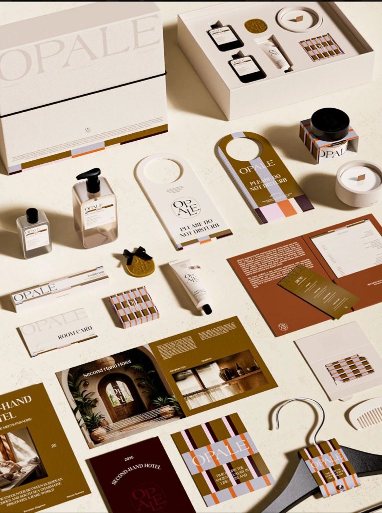
The OPALE identity is built around the idea of discovering an unexpected world where European heritage meets tropical charm.
The design takes inspiration from classical architecture, warm Mediterranean interiors, vintage hospitality materials, and the relaxed atmosphere of a tropical getaway.
Rather than creating a conventional luxury hotel identity, the concept introduces a more personal and nostalgic character—one that feels collected, artistic, and full of stories.
Visual Direction
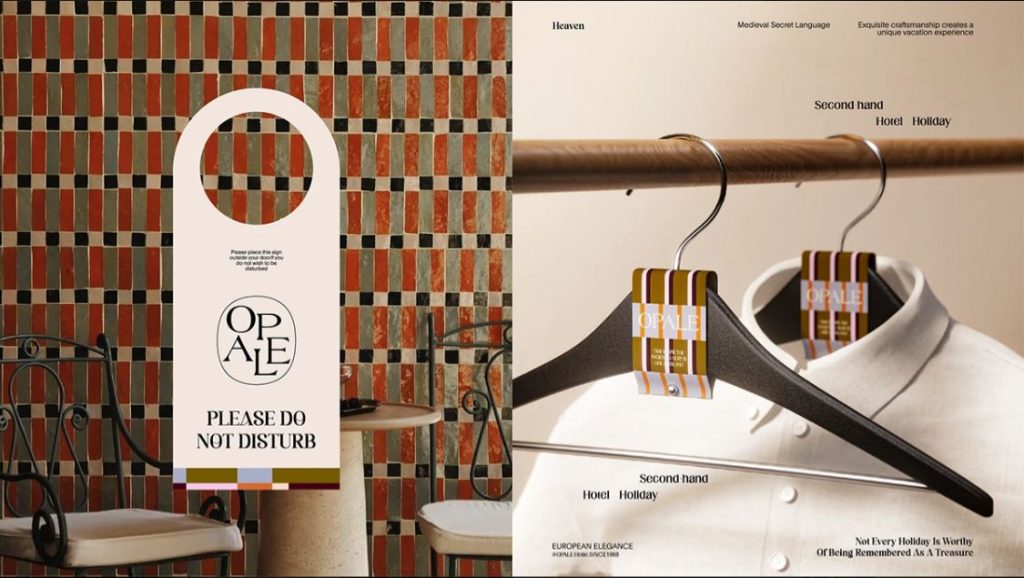
The visual system combines deep olive, warm brown, muted orange, cream, and burgundy to create a rich and sophisticated palette.
These colors work together to evoke aged architecture, natural materials, warm sunlight, and vintage interiors. The combination gives the brand a sense of heritage while maintaining a contemporary appearance.
Typography plays an equally important role. Elegant serif lettering is paired with clean supporting typography to create contrast between the traditional and modern aspects of the brand.
Brand Pattern
One of the key visual elements is the geometric pattern inspired by the OPALE identity.
The pattern introduces a more playful layer to the otherwise sophisticated visual system. It can be applied across different touchpoints, including packaging, stationery, promotional materials, and printed collateral.
OPALE demonstrates how historical references can be transformed into a contemporary visual identity.
Instead of directly reproducing traditional European aesthetics, the design takes selected elements—such as serif typography, architectural references, earthy colors, and decorative patterns—and reinterprets them through a modern graphic system.
The result is a brand identity that feels elegant, warm, nostalgic, and distinctive.