

Enoulite is a branding and packaging design project for a Chinese infant complementary food brand. The project focuses on creating a visual identity that feels playful, colorful, and approachable while maintaining a sense of trust and professionalism for parents.
The visual direction is inspired by the concept of “5-Stage Growth,” representing the different stages of a child’s development. This concept was translated into a flexible visual system through expressive characters, bright colors, playful typography, and distinctive graphic elements.
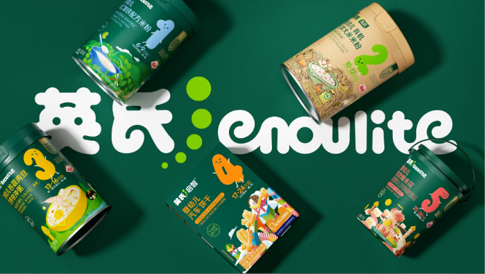
One of the key visual elements is the use of number-based characters to represent each stage of growth. The characters are designed with simple and expressive forms, giving the brand a friendly personality while making each product stage easy to recognize.
The color palette combines a deep green as the primary brand color with brighter shades of yellow, blue, orange, red, and light green. This combination creates a lively and energetic appearance while keeping the overall identity cohesive and recognizable.
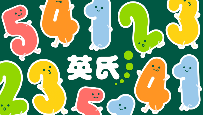
The visual identity is not limited to the packaging itself. The graphic system is also applied across supporting materials such as patterns, masking tape, and other brand elements. Repeated use of the characters, numbers, and graphic motifs helps create consistency across different applications.
The playful pattern, featuring colorful characters and bubble-like elements, adds movement and personality to the brand. These elements help connect the different products while creating a visual language that feels youthful and memorable.
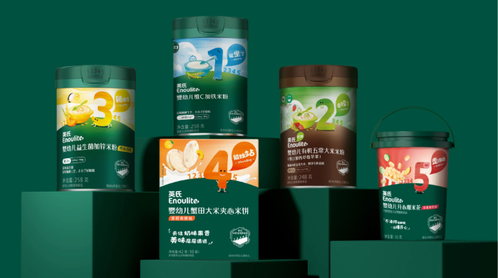
Packaging plays an important role in communicating both the product information and the personality of the brand. Each package follows the same overall visual system while using different colors, illustrations, and number characters to distinguish between the various growth stages.
The consistent layout allows the products to be easily recognized as part of the same brand family, while the individual illustrations and color combinations give each stage its own identity.
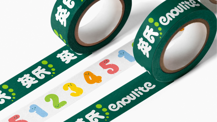
Overall, the Enoulite project explores how graphic design, branding, illustration, typography, and packaging can work together to create a strong and cohesive visual identity.
Through a playful visual approach and a flexible design system, the project transforms a functional infant food product into a brand that feels more engaging, expressive, and memorable while remaining relevant to both children and their parents.